Ugly on Purpose: The Indie Web Creators Turning Bad Design Into a Statement
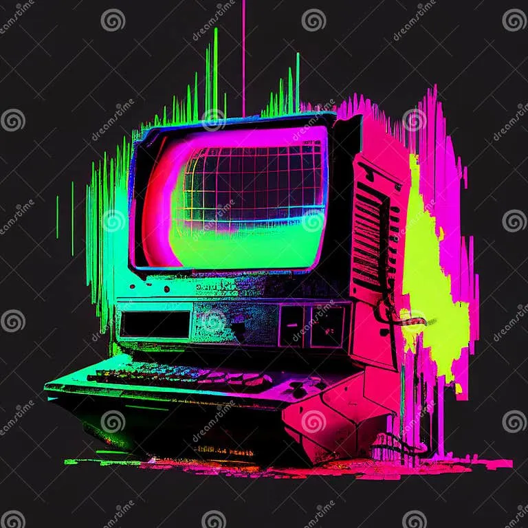
Photo: colorful chaotic retro computer screen glitch aesthetic, via thumbs.dreamstime.com
The website loads and your first instinct is that something went wrong. The background is a tiling JPEG of clouds. The font changes three times in a single paragraph. There's a visitor counter in the corner — the old kind, with the little flip numbers — and it reads 000412. A MIDI file starts playing automatically and you can't figure out how to turn it off.
You are not on a broken website. You are on someone's intentional masterpiece.
Across the indie web — on Neocities, on personal domains, in the weirder corners of Tumblr and itch.io — a generation of creators is deliberately building digital spaces that look like they were made in 1999 by someone who'd never heard of UX. And the more the mainstream internet smooths itself into an identical, frictionless surface, the more these chaotic little websites feel like a genuine act of rebellion.
The Aesthetic Has a Name (Sort Of)
People call it different things. Anti-design. Brutalist web. Chaotic web. The most common term floating around right now is "indie web aesthetics," though that's a pretty wide umbrella. What unifies all of it is the deliberate rejection of what the corporate internet has decided a website should look like.
You know the look. Clean sans-serif font. White space. A hero image with a short tagline. A grid of cards below it. A sticky nav bar. Everything rounded, everything accessible, everything optimized for conversion. It's the design language of Squarespace and Shopify and approximately every startup that launched between 2015 and today.
The indie web crowd finds this deeply boring. More than that, they find it suspicious — a visual language that's been so thoroughly optimized for selling things that it's basically become the aesthetic of being sold to.
"When a website looks too clean, I don't trust it," says one Neocities creator who goes by the handle vvvvvoid online and has been building personal sites since she was 14. "It means someone put a lot of money into making me feel comfortable. And I start wondering why they needed to do that."
What Ugly Actually Looks Like
The anti-design aesthetic borrows heavily from specific eras of web history — particularly the late 1990s and early 2000s, before CSS became sophisticated enough to enforce visual order. But it's not pure nostalgia, and it's not just lo-fi.
Creators in this space will mix genuinely retro elements — tiling backgrounds, blinking text, web-ring badges — with contemporary content. You'll find a site with a GeoCities-era layout that's hosting a sharp essay about algorithmic anxiety. Or a personal page with a broken image placeholder as the header and an extremely thoughtful reading list underneath.
The brokenness is often load-bearing. A deliberately missing image or a layout that shifts weirdly on mobile isn't a bug — it's a signal. It says: I made this myself. Nobody's paying me to make it look professional. This is just mine.
Some creators go further, building navigation that's genuinely confusing — links that lead to unexpected places, pages that loop back on themselves, sections that seem to appear and disappear. It's less about nostalgia and more about treating the website as an experience rather than an interface.
The Neocities Effect
If there's a spiritual home for this movement in 2024, it's Neocities. Launched in 2013 as a direct homage to GeoCities (which Yahoo shut down in 2009), Neocities gives anyone free hosting and a text editor, then mostly gets out of the way.
The platform has grown significantly over the last few years, driven largely by young users — many of them Gen Z — who found it through TikTok, Tumblr, or word of mouth. The appeal isn't just the freedom to make something ugly. It's the freedom to make something personal in a way that social media no longer really allows.
"On Instagram or TikTok, you're filling out a template," says Marcus, a 22-year-old in Portland who runs a Neocities page dedicated to his ongoing obsession with obscure fighting game lore. "You can customize it a little, but the platform decides what it looks like. On Neocities, I decided everything. Including the stuff that looks bad."
His site has a black background, yellow text, and a sidebar that's technically a table from 2003 HTML. It also has some of the most detailed, lovingly written game analysis you'll find anywhere online. The two things coexist without any apparent tension.
Corporate Web vs. The Chaos
It's worth taking the broader cultural context seriously here, because the anti-design movement isn't happening in a vacuum.
The last decade of web design has been characterized by an almost aggressive push toward uniformity. Design systems, component libraries, and the dominance of a handful of frameworks have made it easier than ever to build something that looks polished — and harder than ever to build something that looks different. The result is a web where a startup's landing page, a major news outlet, and a personal blog can all look like they were built from the same template.
That uniformity isn't accidental. It reflects who's been driving web development: venture-backed companies optimizing for engagement metrics, advertising revenue, and conversion rates. The clean, trustworthy aesthetic is a product of those pressures.
Building something that deliberately violates those norms is, in that context, a political act — even if the person doing it is just a 19-year-old who thinks blinking text is funny.
"There's a reason corporations all look the same," says one web designer who works in tech by day and maintains an aggressively chaotic personal site by night. "They've all hired the same consultants who've read the same UX research. The anti-design stuff is interesting because it's asking: what gets optimized out when you optimize for conversion? And the answer is personality. Weirdness. The sense that a human made this."
The Authenticity Paradox
Here's where it gets philosophically messy, and honestly, where it gets most interesting.
As the indie web aesthetic has spread, it's started to get aestheticized in its own right. There are now tutorials on how to make your site look "retro." There are design kits for sale on Etsy that let you add that lo-fi, hand-coded look to a site built on Wix. The rebellion is getting packaged.
Some creators in the space are frustrated by this. Others are more philosophical about it. "Every subculture eventually gets absorbed," shrugs vvvvvoid. "That doesn't mean the original thing was fake. It just means it was real enough that people wanted it."
What the corporate web can't really replicate, though, is the actual mess of it — the sites that are confusing because the person who built them was figuring it out as they went, the broken links that nobody fixed because the creator got busy with real life, the personal pages that haven't been updated in two years because their author moved, or changed, or just got tired.
The anti-design movement is partly an aesthetic. But the best versions of it are also just people making something for themselves on the internet, which is a thing that used to be a lot more common and has become, quietly, a kind of radical act.
The MIDI is still playing. You still can't find the off button. You keep reading anyway.